The Brief
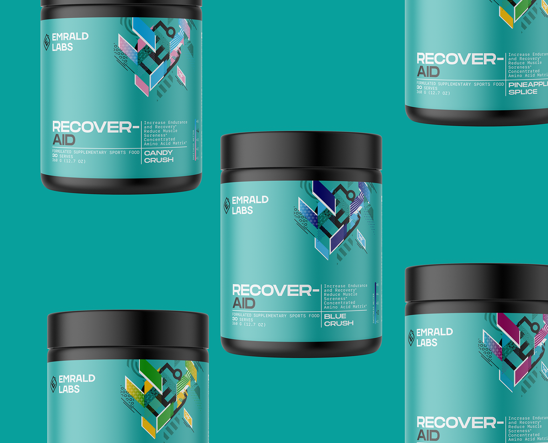
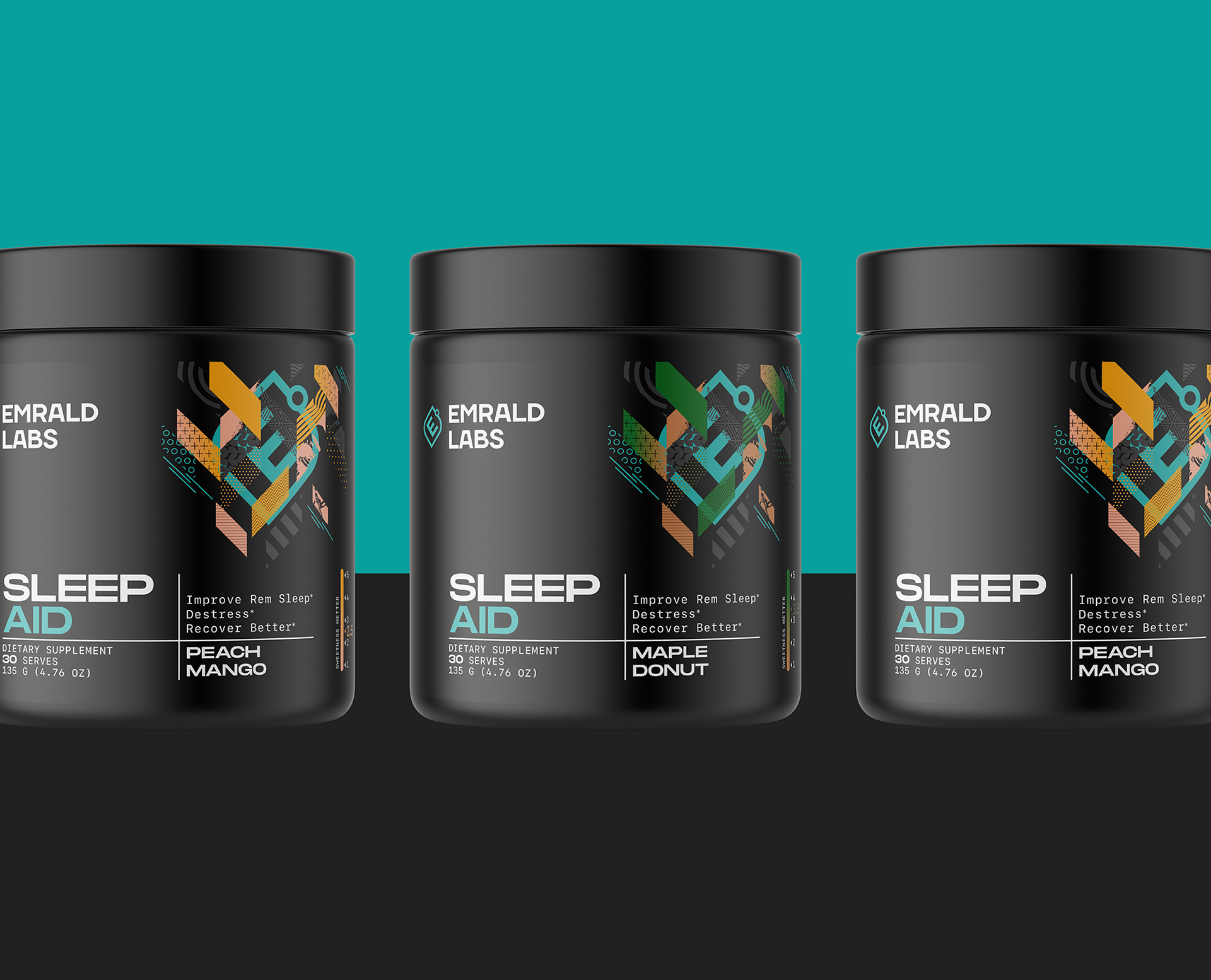
Emrald Labs is a brand of sports food supplements, dedicated to the Australian market. The existing brand image failed to convey information in an organized and clean way, as consumers expected. It was needed for a refresh of the brand image to fulfill the mission, vision, and value of the brand.
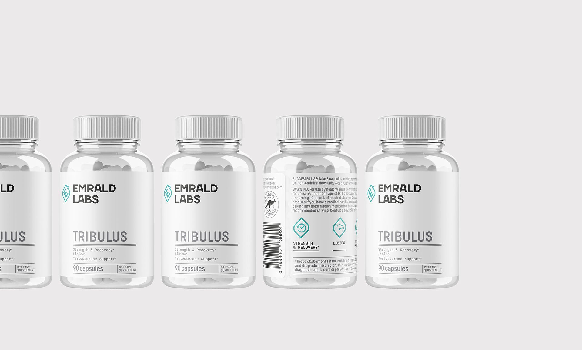
The Solution
The products were divided into two ranges: the commodity range and the specialty range. The two ranges are linked together by the layout of the labels, the abstract graphic element on each label, and the Emrald Labs logo. The white color was used for the commodity range to give a clean, laboratory look. The specialty range has approached an emerald color for most products, with color deviations for special products.
The brand identity was also developed for collateral materials, marketing materials, and accessories.
The brand identity was also developed for collateral materials, marketing materials, and accessories.
Client: Emrald Labs, Australia
Services: branding, packaging design, artwork, product imagery
OLD PACKAGING & LOGO

NEW IDENTITY & PACKAGING


What the client said:
"The collaboration between Horea Studio and us was extremely professional with clear and concise objectives. They had the most significant and important influence over the new design theme which has brought to life our new brand. Not only was the design micro-managed and detailed but speed to market was a great achievement.
Sales are up over 200% since the rebrand and consumers are looking for EmraldLabs products.
From small business to large, Horea Studio has been instrumental to our brand's progress since 2020."
Domenic Giampaolo, Director, Elite Supps Australia