Challenge
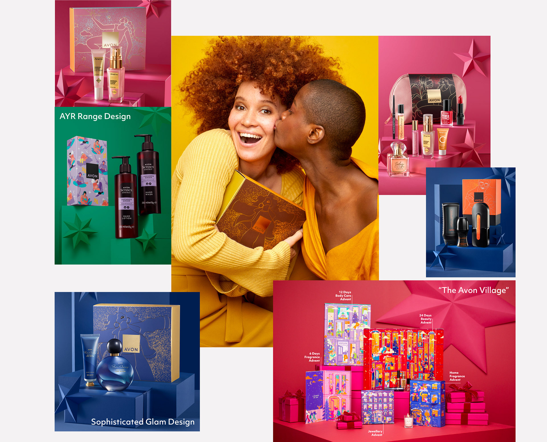
Avon decided to have a diverse design portfolio for the gifting range and wanted to develop 3 design routes that are different enough, but also have visual cues between them.
Consumer target: 16-65yo Markets: EMEA
Creative Solutions
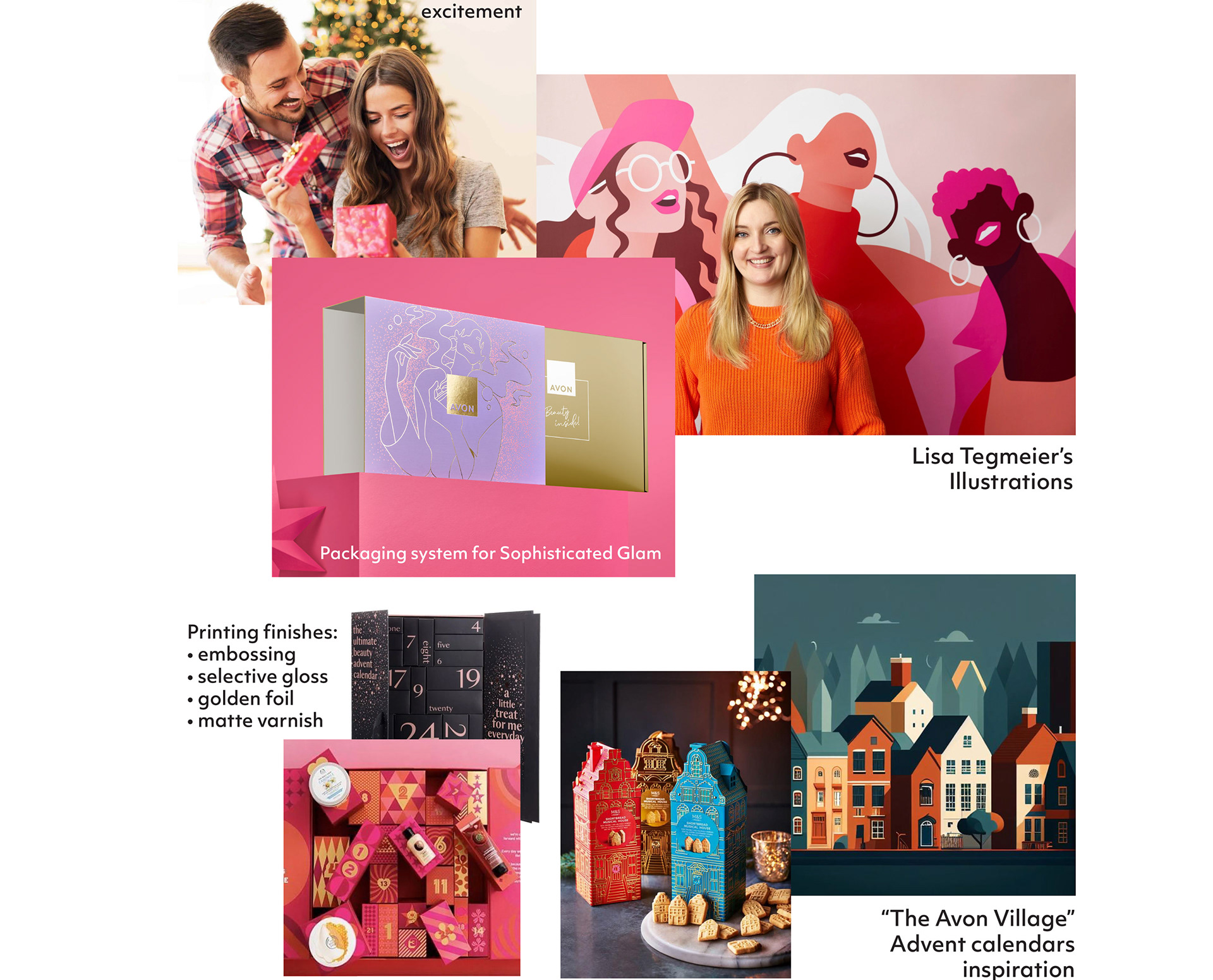
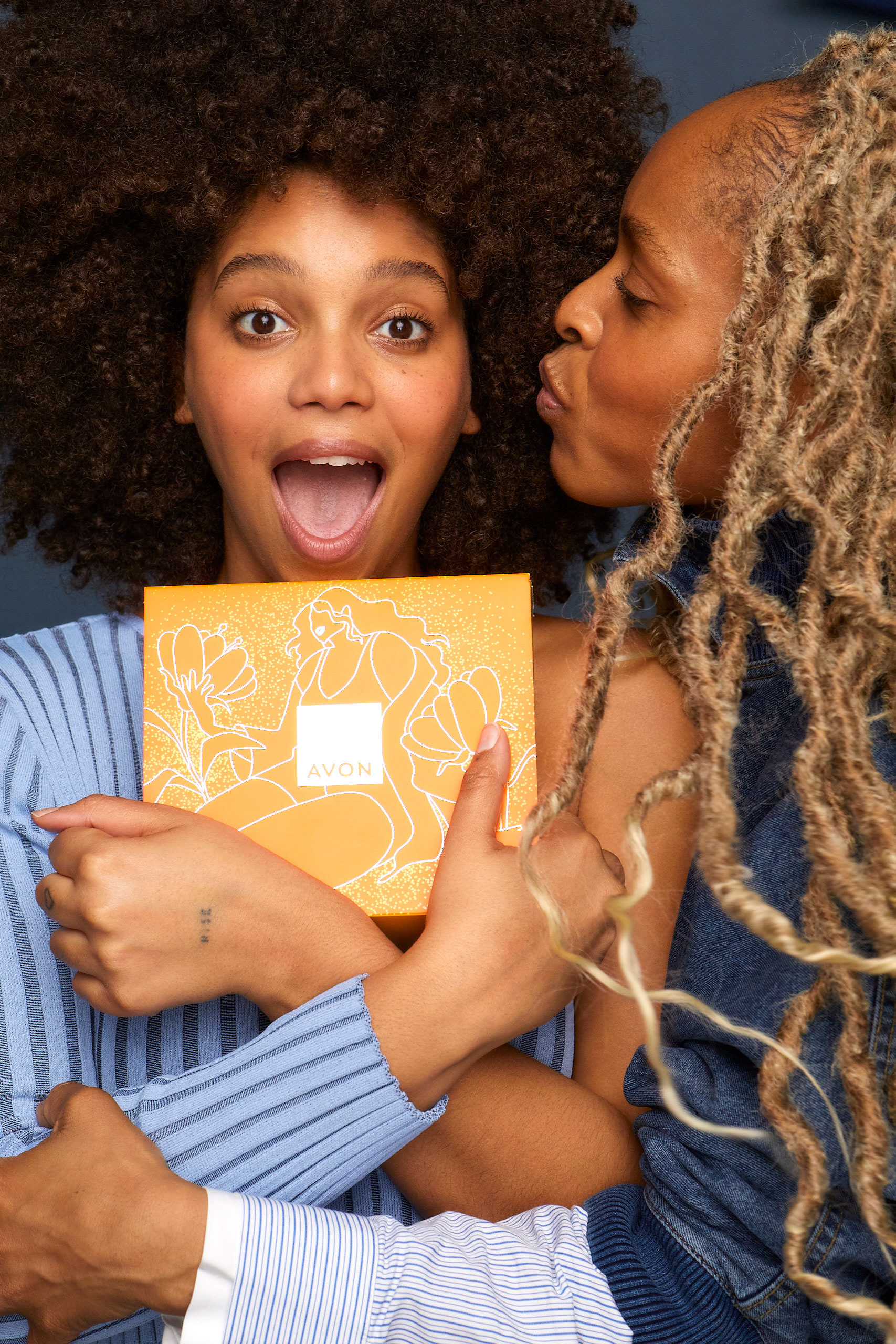
In collaboration with the Gifting Brand Lead, we commissioned an illustrator to create exceptional and distinctive illustrations that effectively communicate Avon's values, community, and diversity.
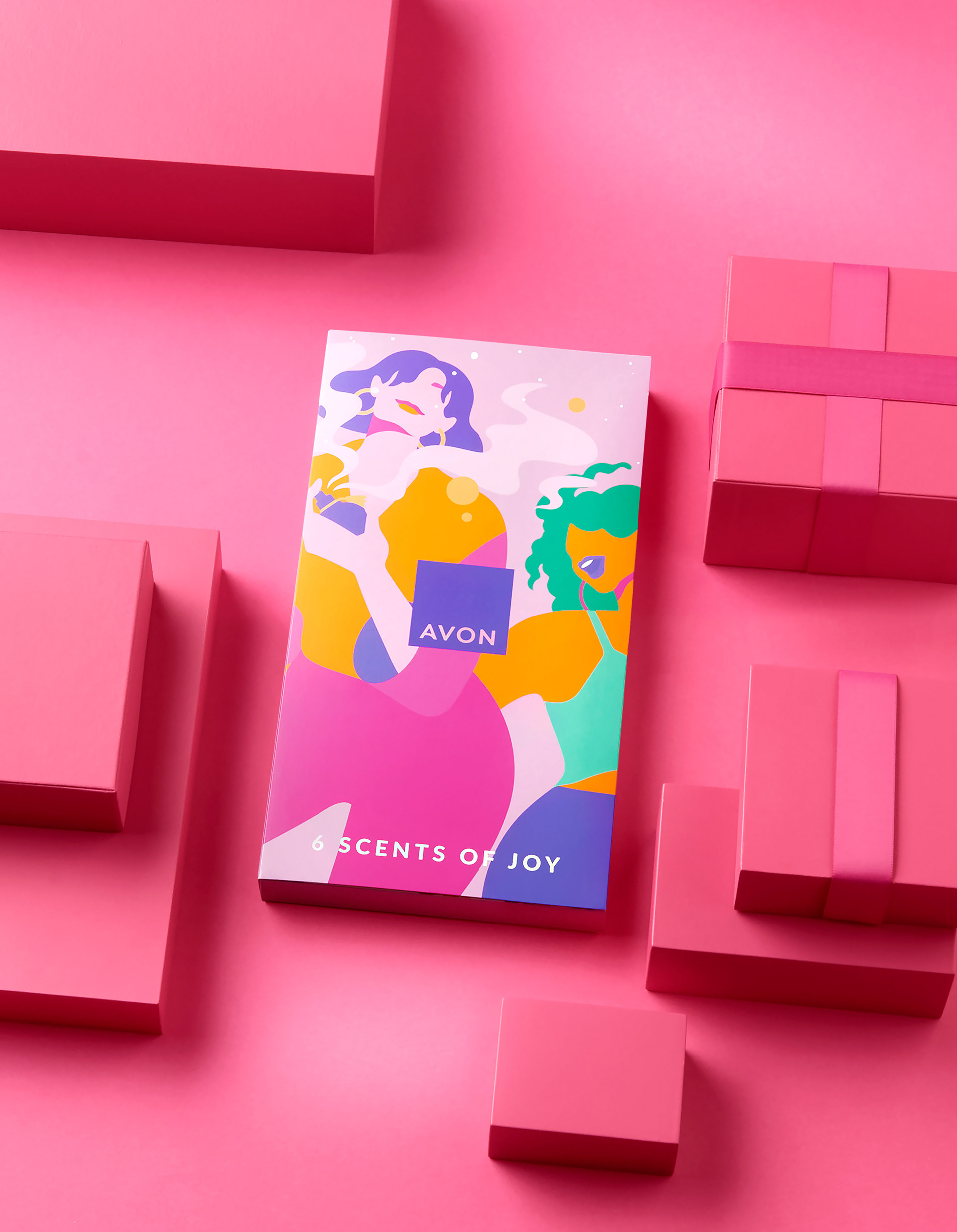
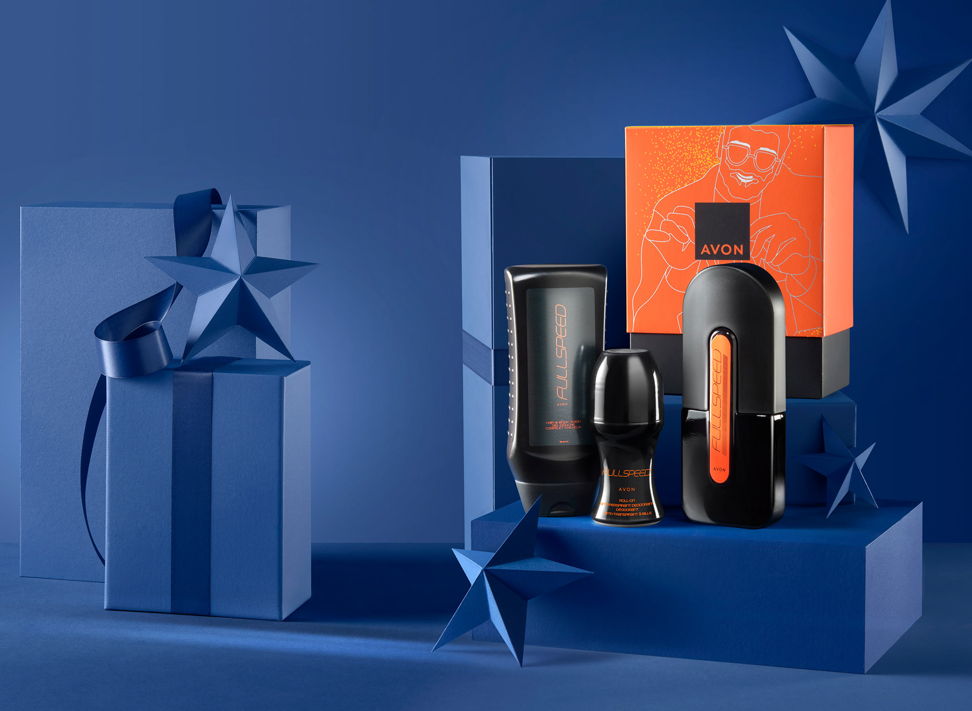
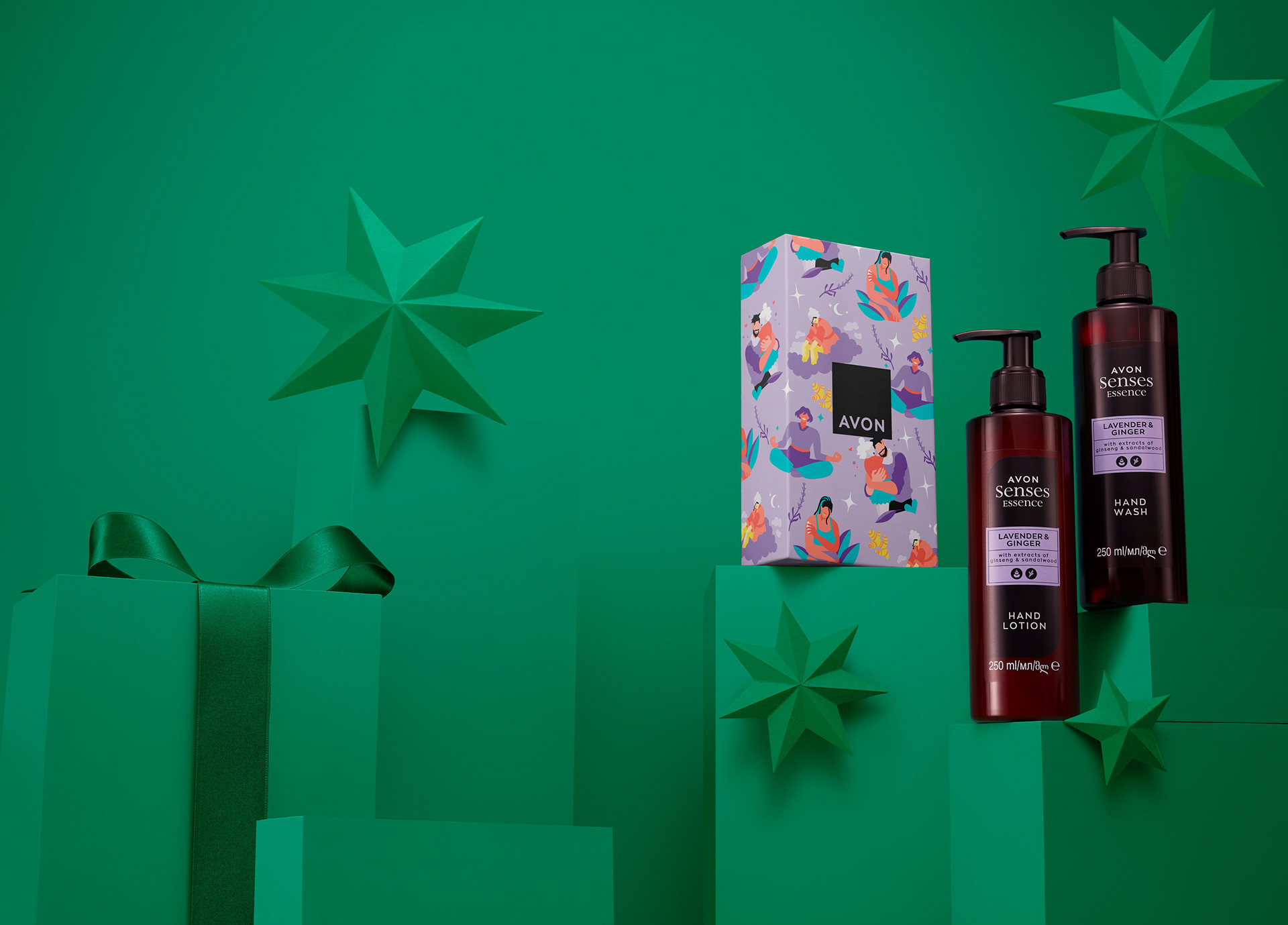
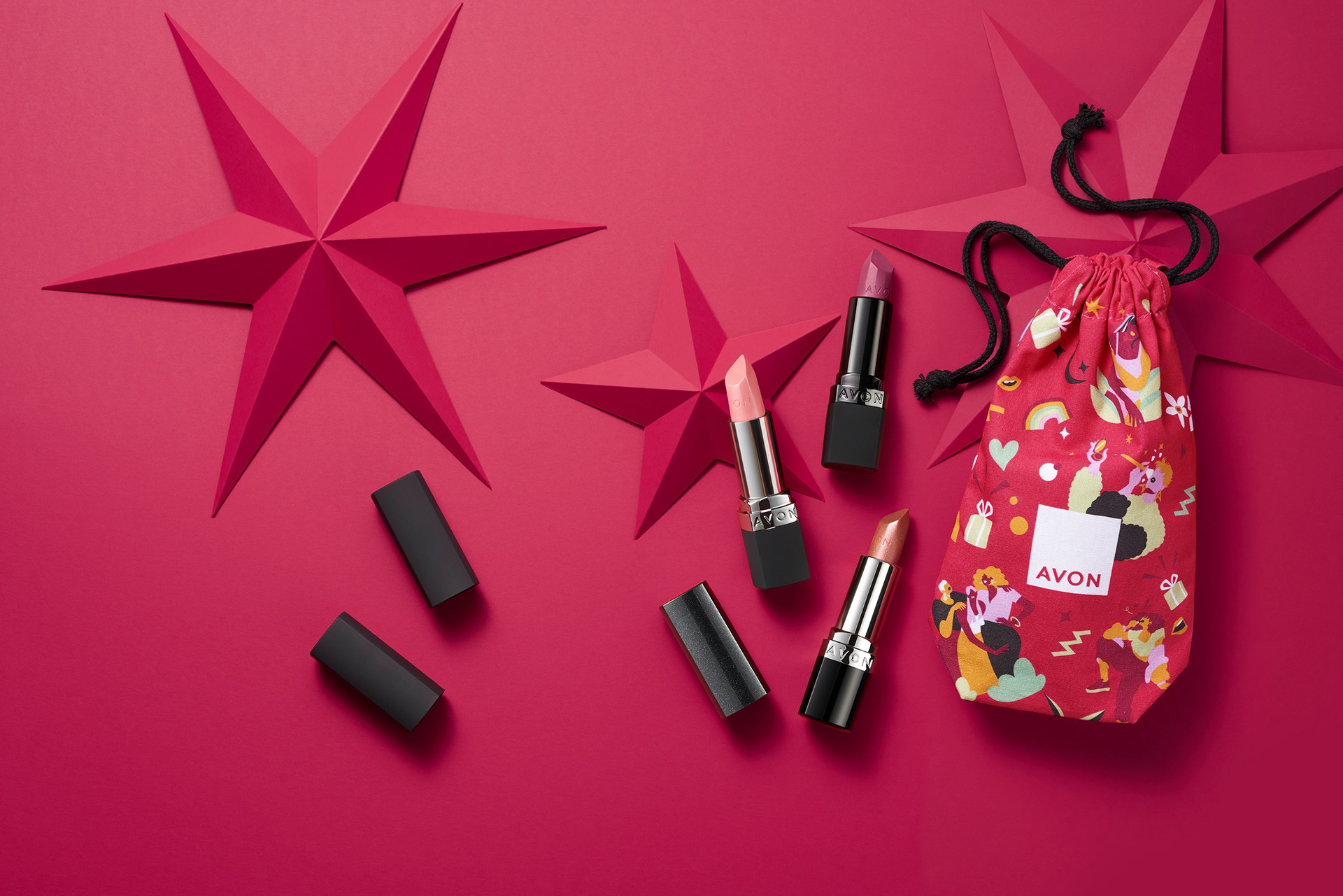
The central idea I proposed revolves around capturing the emotion and thrill associated with unwrapping a gift. To depict this excitement, the main illustration is accompanied by sparkling elements, symbolizing that burst of joy. For the AYR range, it was adopted a more youthful and pattern-oriented design approach, catering to the unique preferences of each consumer and market.
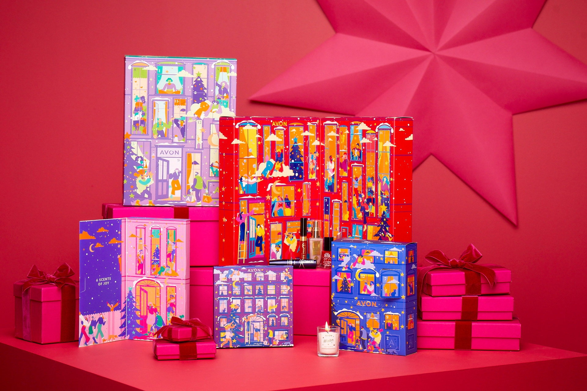
To establish visual cohesion between the two concepts, we utilized illustrations and vibrant colors as common elements. In total, I designed 85 gift sets, including 6 advent calendars.
To establish visual cohesion between the two concepts, we utilized illustrations and vibrant colors as common elements. In total, I designed 85 gift sets, including 6 advent calendars.
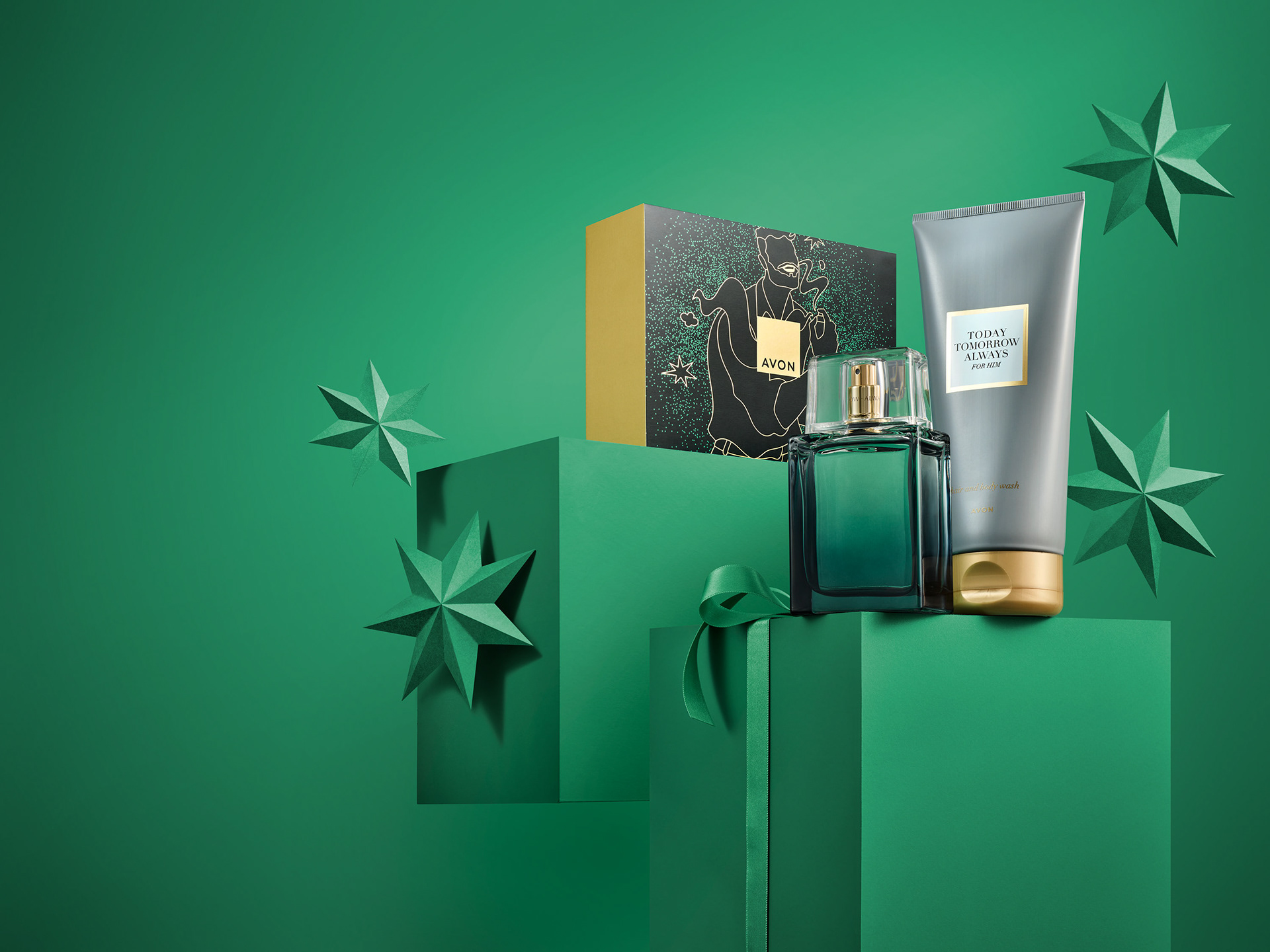
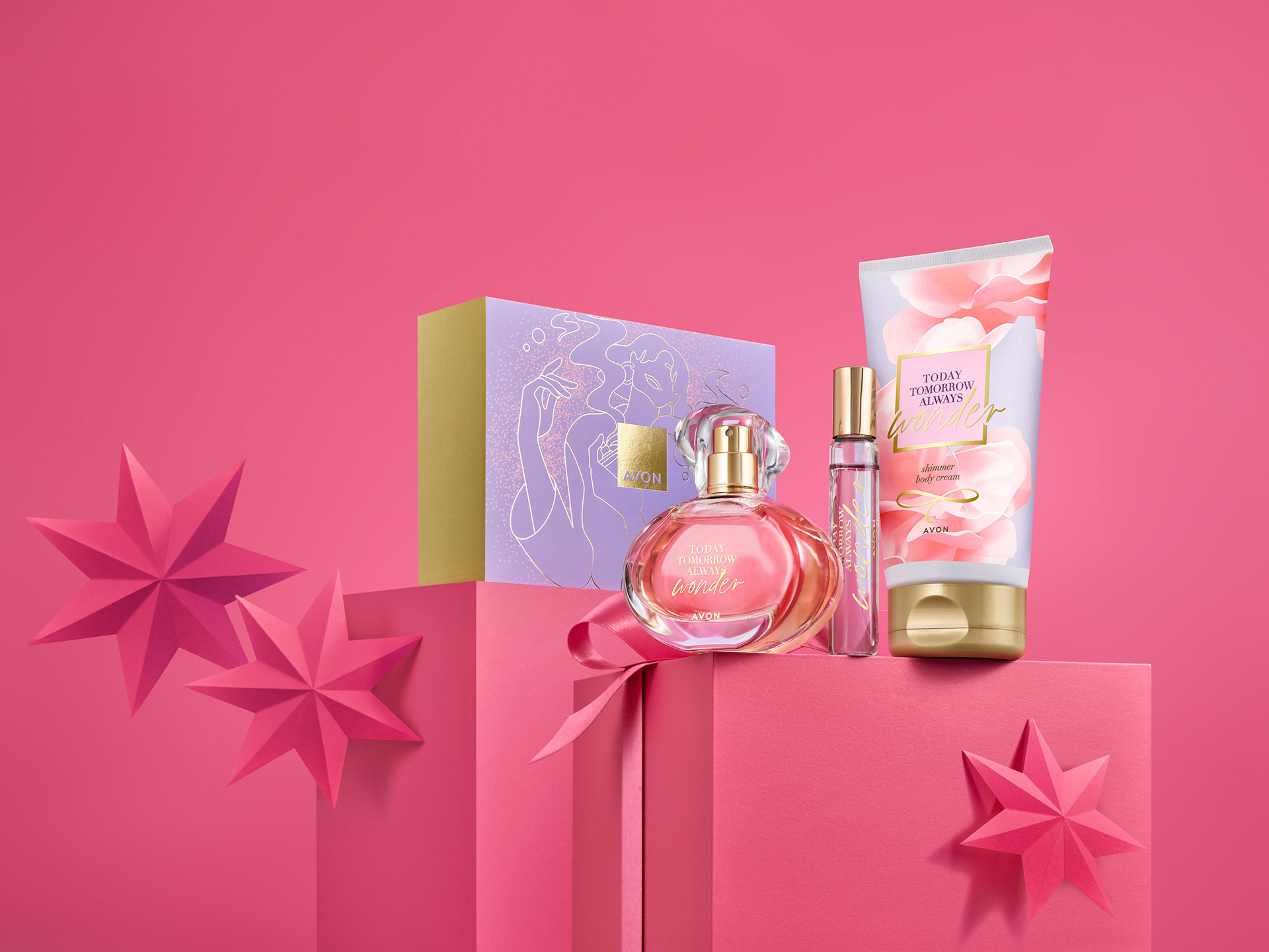
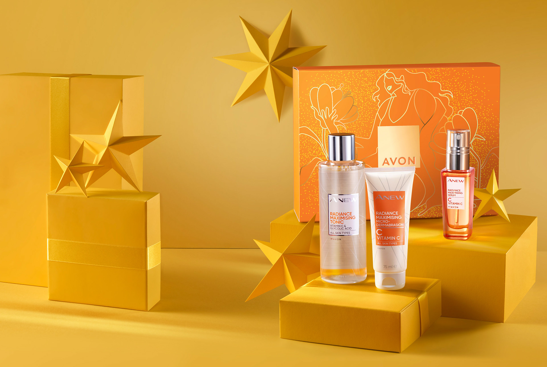
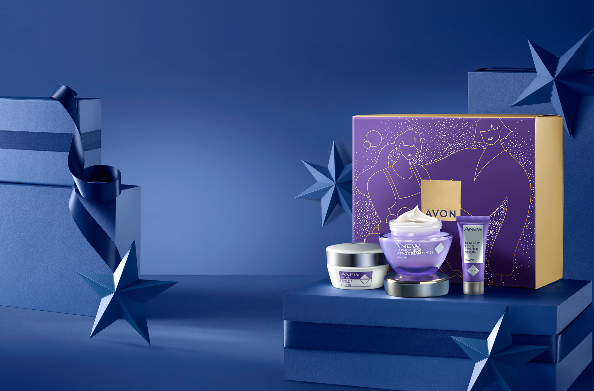
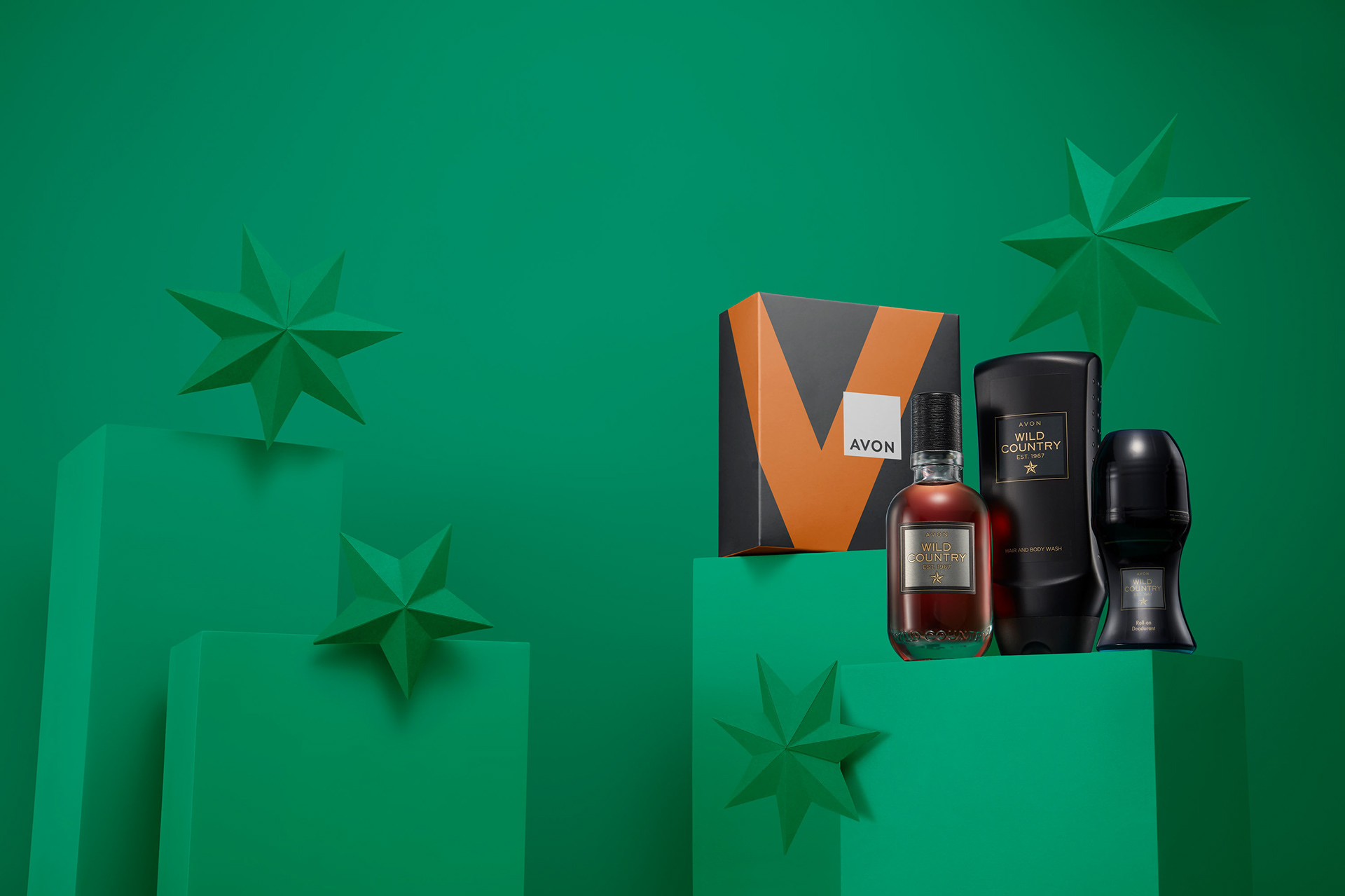
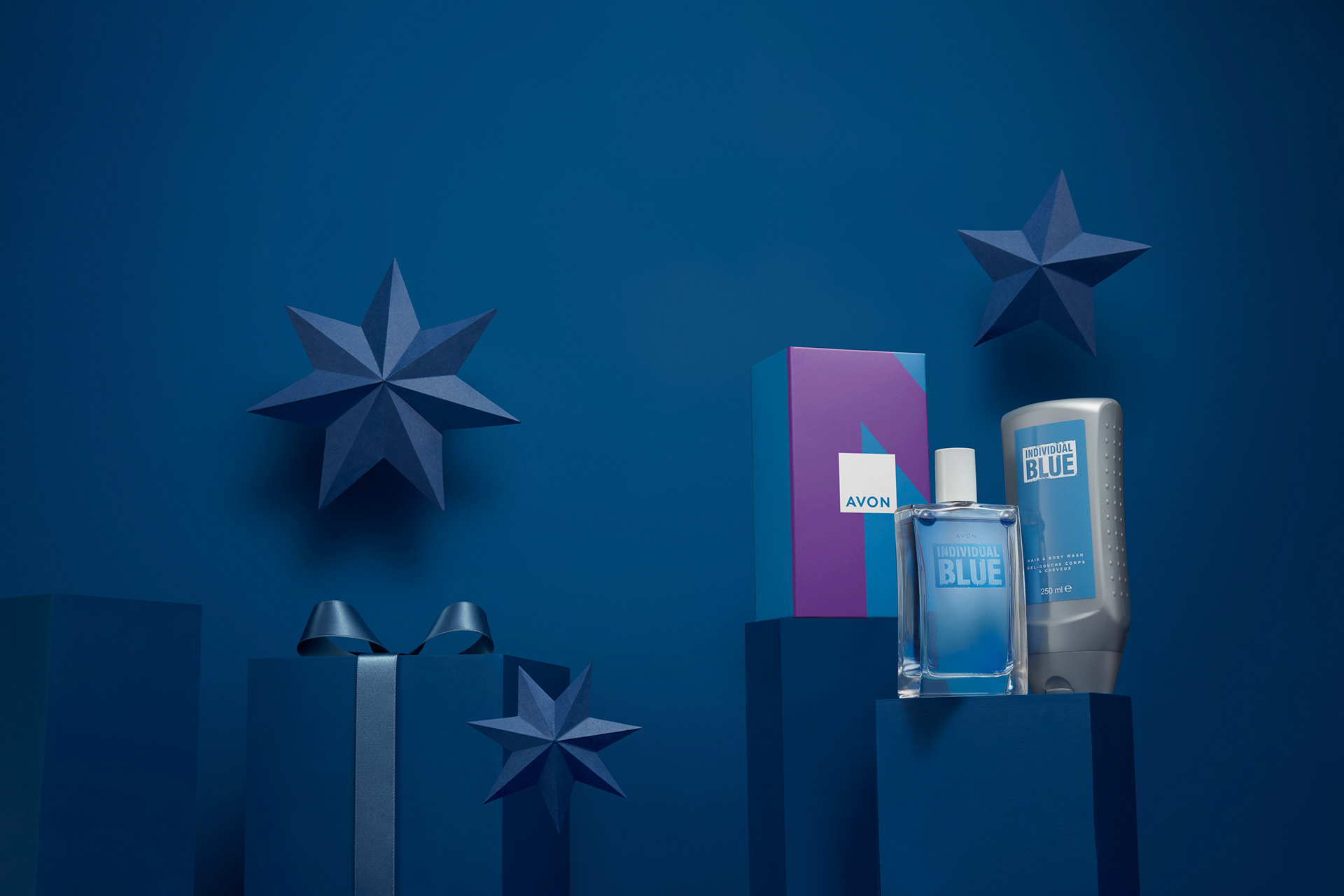
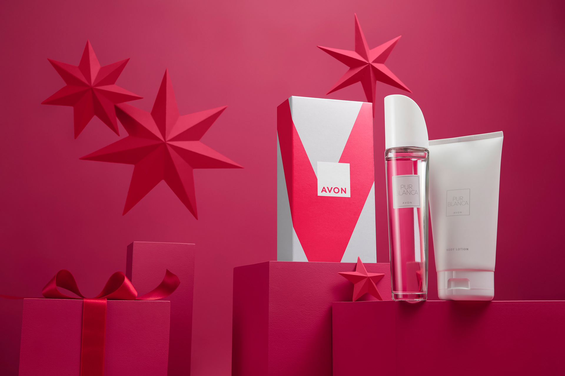
Avon recognized the importance of providing consumers with diversity, not only in the range of products offered but also in the packaging design. Consumers seek appealing gifts that avoid excessive branding, as they may be perceived as cheap. Consequently, I proposed a shift in focus towards the illustrations and the AVON logo, omitting sub-brands and unnecessary information on the front of the packaging to elevate the design.
To create a captivating visual experience, each package features a modern and vibrant color combination that resonates with the products inside. The intention was to develop a packaging design that could be used throughout the year, rather than exclusively during the winter holidays, resulting in a comprehensive and versatile look.
For the premium gifts, I suggested a Sophisticated Glam design approach. Using the same illustrations but on a different scale and with a more graphic interpretation, we achieved the desired premium aesthetic. Understanding the expectations of consumers in the target markets was crucial for crafting a premium package. Consequently, I have incorporated high-quality printing finishes, including embossing, selective gloss, golden foil, and matte varnish.
Regarding the advent calendars, each box represents a building, collectively forming The Avon Village, symbolizing Avon's core value of community. I constructed each design using customized assets tailored to each size and cutter, ensuring a cohesive and visually engaging experience.
Deliverables
Packaging design concept and implementation
Printing finishes recommendations.
Agency: Oliver
Client: AVON
Design direction: Sarah Priestley
Designer: Horea Grindean
Illustrator: Lisa Tegmeier
Photography: AVON