Challenge
Packaging design concept and development for haircare range within the AVON CARE brand.
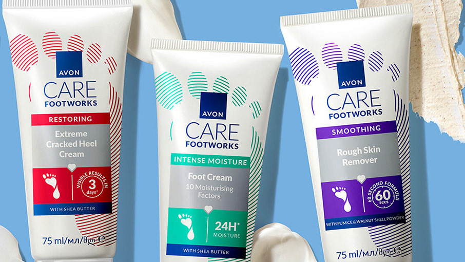
AVON CARE is an affordable range dedicated to families.
Consumer target: 10-75 yo. Markets: EMEA & LATAM.
Creative Solutions
In order to develop a compelling creative concept, I have made the decision to focus on highlighting the natural ingredients while establishing a visual connection with the AVON CARE master brand - the moisture heart.
The ingredients play a significant role in the design as they provide essential moisture and other benefits to your hair. During the process, I worked on enhancing the images by incorporating moisture and oils into the ingredients. To ensure that the design aligns with the highest standards in haircare, I have created a clean and sleek rectangular float. This float serves as a platform to showcase the key information while also adapting the design to meet the specific benchmarks of haircare products. The upper section of the labels was exclusively dedicated to highlighting the moisture heart and the AVON CARE Haircare logo, emphasizing the utmost care and attention given to this range. Initially, the bottle color was beige. However, to achieve vibrant colors and showcase the white formula heart effectively, I made the decision to switch to a white bottle.
Agency: Oliver
Client: AVON
Design Direction: Dana von Bargen
Designer: Horea Grindean
Image composition: Horea Grindean
Photography: AVON

