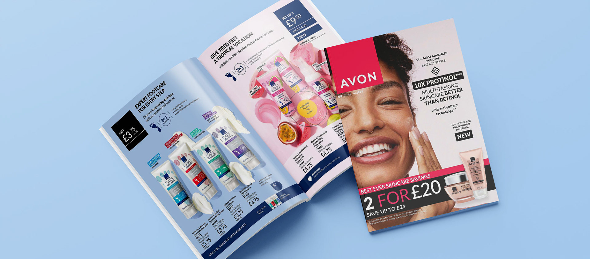
Challenge
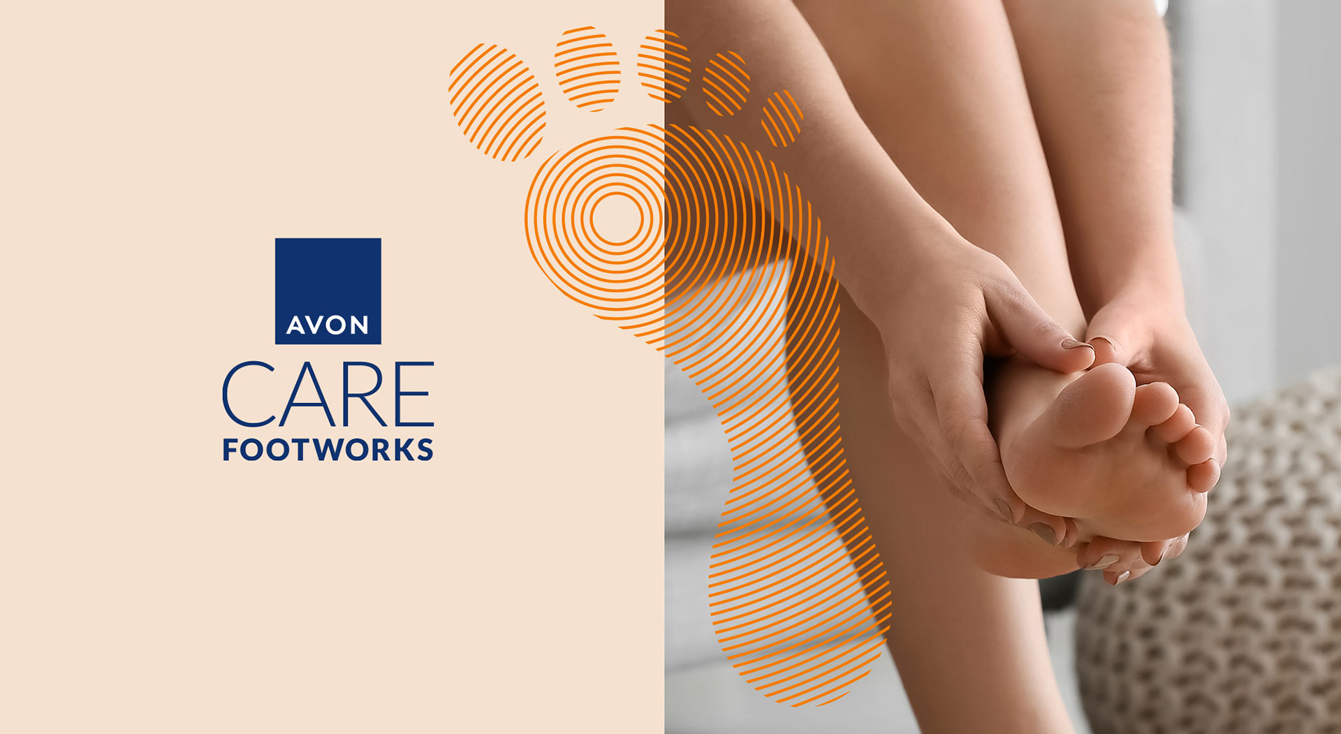
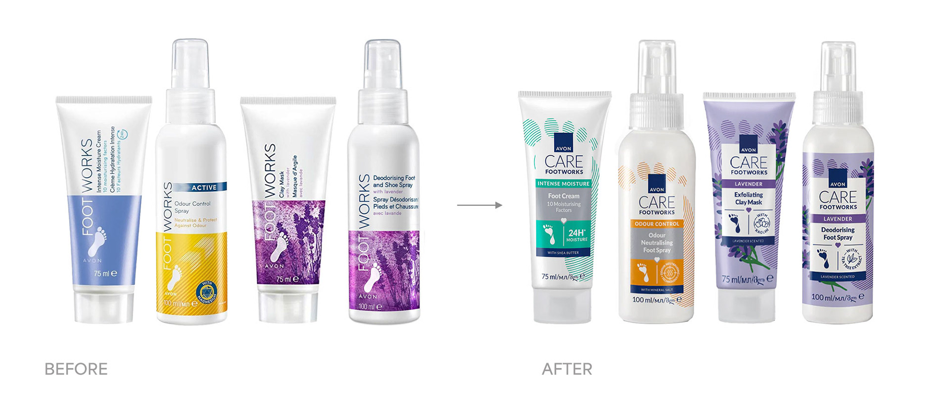
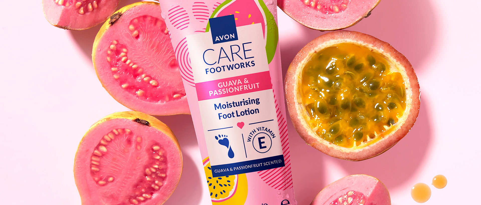
Avon Footworks has been repositioned under the Avon Care umbrella as Avon Care Footworks. The new design should align with the overall Avon Care identity, featuring the signature blue colour and the distinctive “float” element that unifies all product information. The Avon Care Footworks portfolio is structured around two key platforms:
Benefit-led products – expert, advanced formulas with performance-driven claims.
Ingredient-led collections – seasonal ranges inspired by sensory ingredients.
While both platforms should clearly belong to one cohesive brand through consistent design elements, each must convey a distinct personality and positioning for the consumers. Incorporating footcare-specific visual codes and cues was essential to ensure clear product identification and easy navigation across the range. Maintaining the established colour-coding system is also crucial to support recognition and loyalty among existing consumers.
Creative Solutions
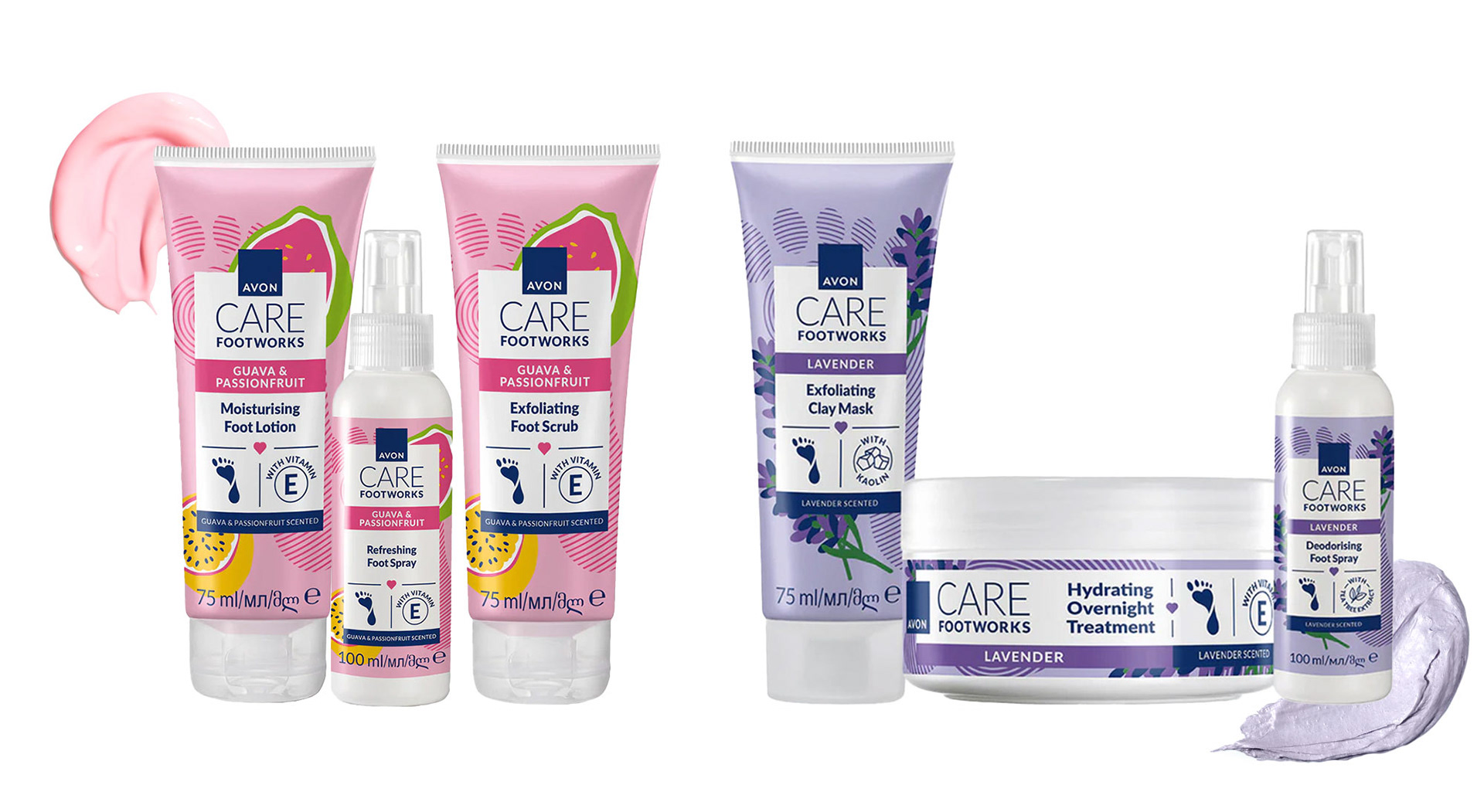
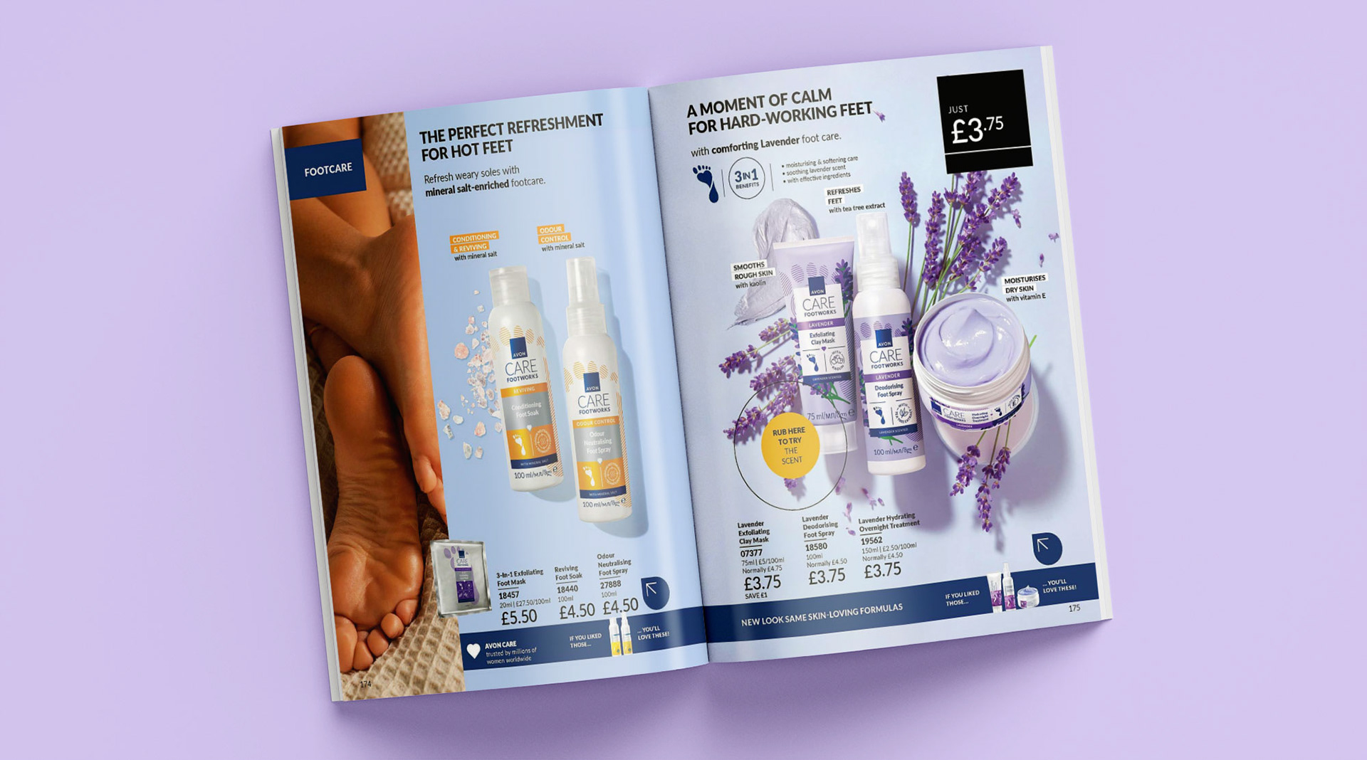
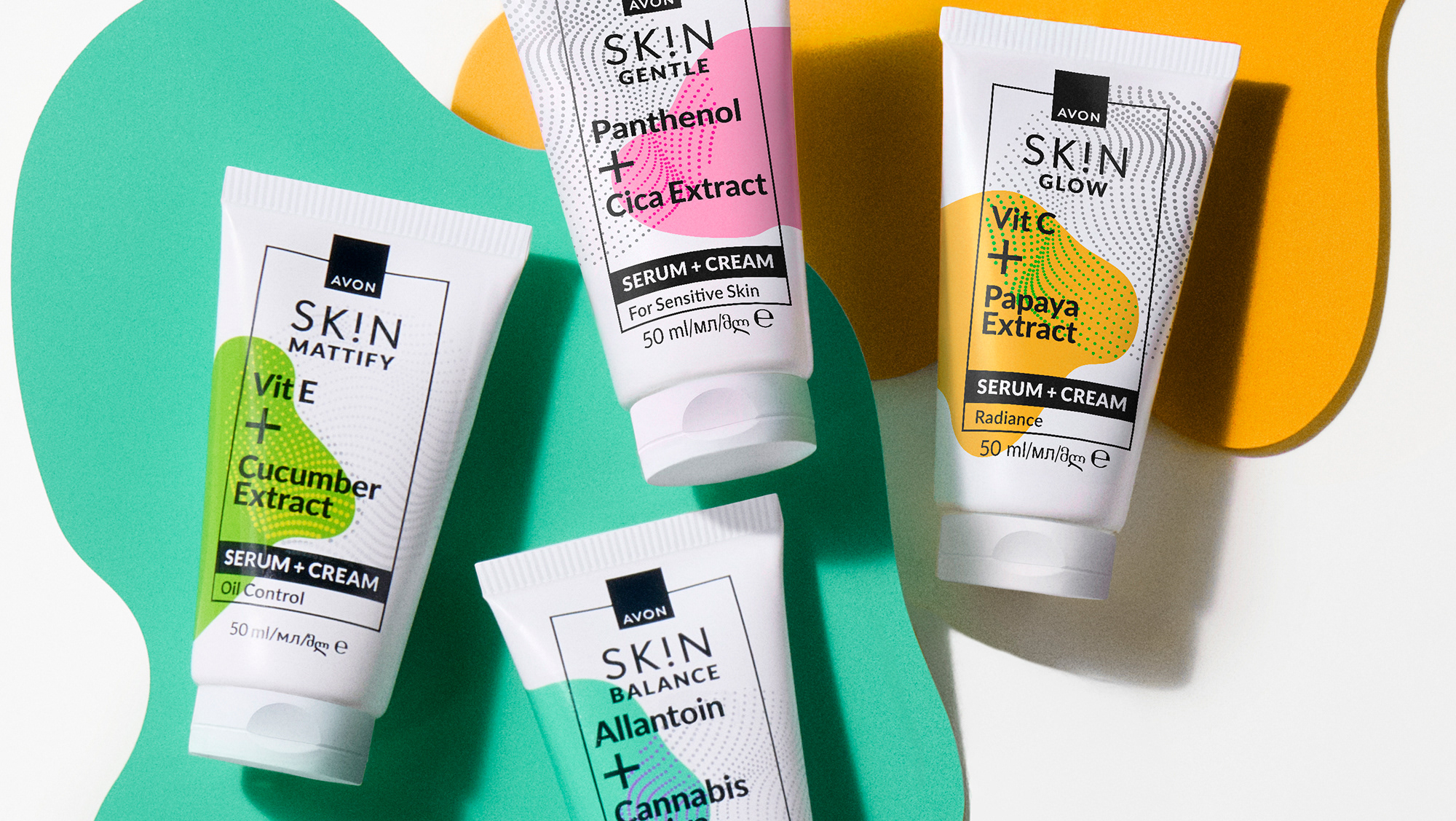
A cohesive packaging design was built for brand reliability — consumers see a clear system of products that work together. Consistent visual branding strengthens brand recall — even without reading, the consumer will recognise it is a product dedicated to foot care because of the representation of a footprint in the design.
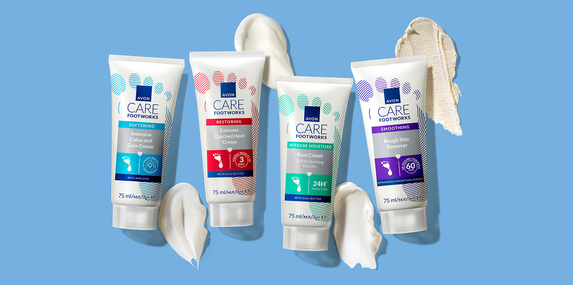
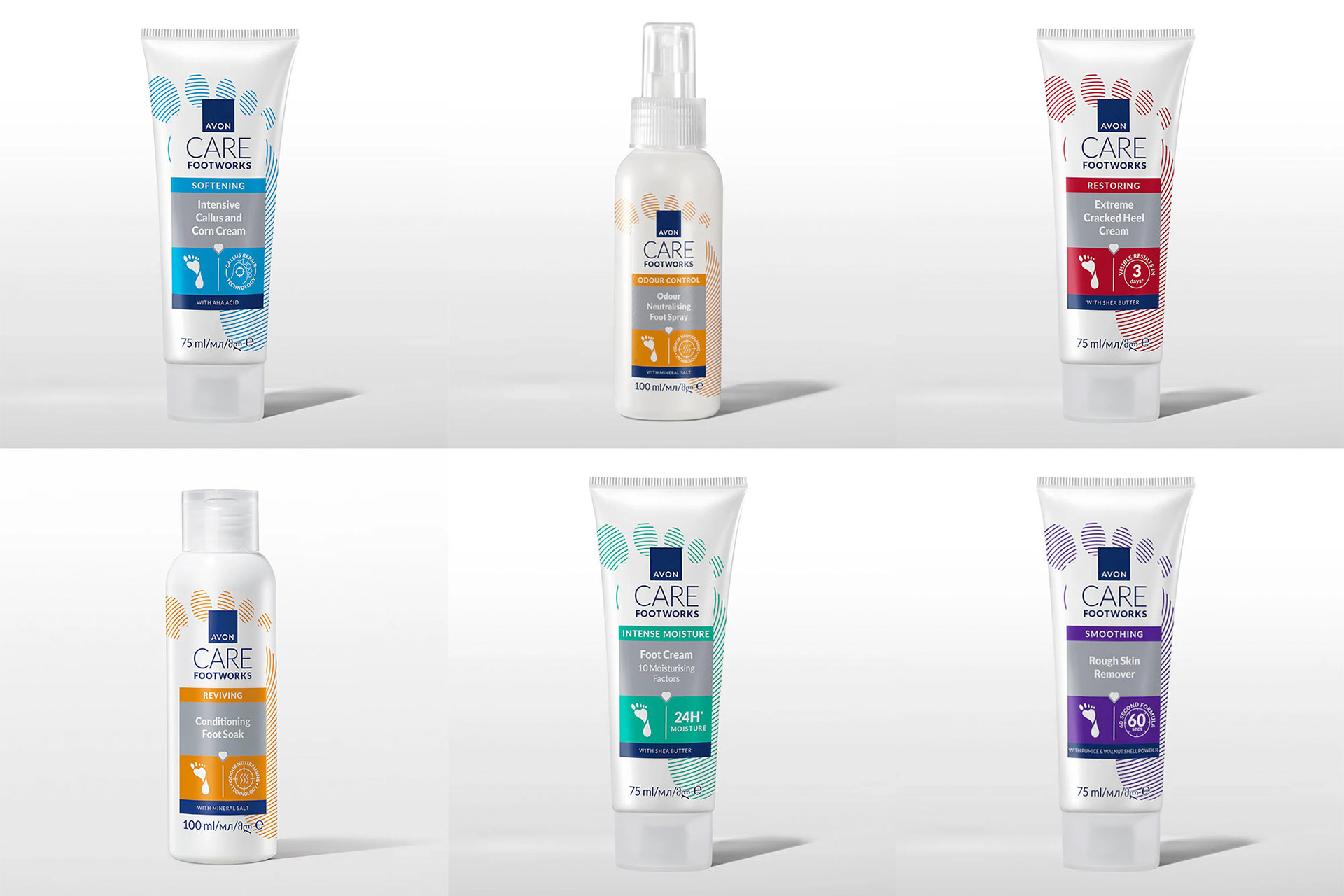
On the benefit-led range, the clinical-meets-care aesthetic (white + colour highlights + clean lines) balances trustworthiness and approachability. Each product variant has a distinct colour-coded identity, making it easier for consumers to recognise and choose based on their specific needs (callus, cracked heels, moisture, rough skin). The use of icons (footprint, heart, time symbols) adds a visual shorthand for key benefits.
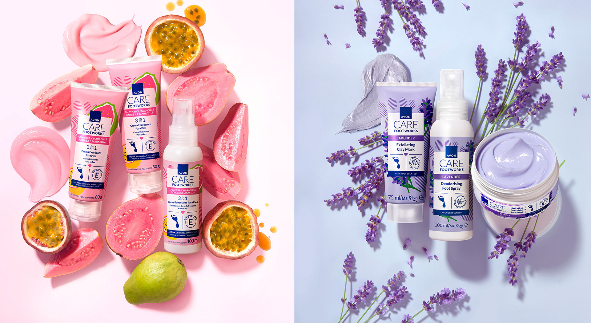
For the ingredient-led collections, Avon shifts from purely functional to sensorial and self-care positioning. The result: Foot care as part of a spa-at-home experience, not just a necessity. The image elevates Footworks beyond simple foot care — it presents the line as a pampering beauty ritual. The illustrations of fruits and lavender add a natural, sensorial touch, supporting the idea of “nature meets science.” Each collection tells a sensory story — you can almost “feel” the scent and texture. The combination of efficacy + enjoyment (care and pampering) increases emotional connection to the product range.
Deliverables
Packaging design concept and implementation
Printing finishes recommendations.
Client: AVON
Design Concept & Implementation: Horea Grindean
Photography: AVON